Taking a niche brand to the next level.
CHALLENGE
TAD Gear is an extreme outdoor apparel company founded by artist, designer and former military serviceman, Patrick Ma. The company literally started in Patrick’s garage some 15 years ago. During that time, he nurtured and grew a dedicated audience of military/tactical enthusiasts and built the business up to a few million $$ in annual sales.
The rabid fandom of his audience was responsible for spreading the word about TAD Gear, mostly through social media channels. In fact, although they had a unique brick and mortar store in San Francisco, most of the company’s sales were online-driven. And their niche influence was considerable, with knock-offs of their coolest stuff turning up in black markets around the world.
Patrick challenged the Loomis Group team to devise a new brand strategy that identified a larger target audience for his products than the current dedicated group of hardcore aficionados. The catch was that he wanted to enlarge the scope of the brand without alienating his devoted enthusiasts. And he wanted that new brand identity to come alive first and foremost on the Web – with the kind of design that wasn’t just pretty, but also made it easy to purchase.
WORK
As a part of the pitch process, I worked closely with a small team of brand strategists to identify the right audience for expansion, write the new brand strategy, and gain client buy-in. Then I lead a team of designers on creative executions.
Here’s where the work led us:
- Brand strategy – Through our research into leading outdoor apparel brands, we were able to identify an audience sweet spot for TAD Gear. This turned out to be a sizable population of what can be termed modern explorers, whose thirst for journeying off the beaten path was more deeply personal than occupation-driven. However, like TAD Gear’s tactical enthusiasts, these modern explorers valued challenge, the path less followed, technical expertise, fortitude, and bragging rights. Reaching out to this group also made visible what had always been an unspoken brand promise – that TAD Gear offered ‘elite design for the modern adventure’.
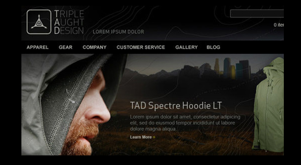
- Brand identity – To bring the company in line with its new brand promise and expanded audience profile, we recommended that TAD Gear simplify its logo and go back to the name Patrick had wanted when he first started the company – Triple Aught Design. To those in the know, the phrase “triple aught” means ‘of the highest quality’. The change in name and logo positioned the company as higher end, with the use of the word ‘design’ emphasizing the strong aesthetic sensibility of the apparel.
- Creative execution –While the company’s website had an interesting design aesthetic drawn from the look of topographic maps, its navigation as an e-commerce site was difficult to follow and was leading to a lot of drop-offs. I worked with UI specialists to simplify the navigation and make it easier to find products and purchase. We also made sure to embed social media features into the site so that word of mouth and community could continue its influence. On the overarching look and feel (aka big idea), I worked with the design team on an impressionistic narrative approach, merging imagery of modern explorer, urban cityscape, and wilderness expanse to evoke the story of a modern life lived with both discipline and adventure. Additionally, we created a ‘brand roadmap’ that offered ideas on how to realize the brand beyond the Web through such things as clothing tags, business cards, and short-form messaging.
RESULTS
The re-branding of TAD Gear to Triple Aught Design yielded a number of impressive results:
- Doubling of annual sales driven in large part by the arrival of unique new customers to the website, as well as the retention of its existing audience
- Extensive coverage in relevant blogs and websites, including Acquire, TrailSpace, Gear Patrol, Daily Hiker, and GearGals
- An invite to New York’s famed Fashion Week with Triple Aught Design clothing featured in a special curated section
- An explosion of Facebook fans going from five thousand to over 12,000 in less than a year, plus a near 30% increase in Twitter followers
What is especially notable about Triple Aught Design’s rebranding is how it changed the conversation about the company – expanding from a feeling of “boys and their toys” to a shop recognized for its high-quality apparel design for adventurers both male and female. The company is now planning to open their third brick and mortar store.

